Abigail Douetil
Friday, 23 March 2012
Monday, 19 March 2012
Saturday, 17 March 2012
Task 4: Media Technology in poster and digipak
To create our poster and digipak we used Adobe Photoshop in order to create a proffesional looking result. It is an artistic tool for digiatal craftmens. For example in our CD digipk we have been able to layer images to create a realistic and proffessional looking produtct which promotes the star image.

Image manipulation is evident from the orginal photo to its final outcome. For example the music poster although reliant upon are souced imafers we gad to ensure it approoriately scaled and not stretched. The image was so dominant it had to be composed and focused.
Photoshop alos opperates upon the principle of layering. The CD digipak involved graphic font, images and text. By using layers I was able to create a conventional digipak. The layering enabled me to produce my own orginal product.

The tools we used in photoshop were the cropping: image adjusments and filters. In orderto create the right contrast levels it had to be adjusted and matched other articles in the campaign.

Layout and desgin through photoshop enabled us to porduce this campiagn with its own aesthetic look. Photoshop as a creative tool enabled me to enhance my digital and technology understanding and creativity.
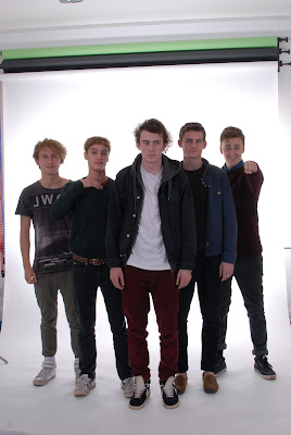
Image manipulation is evident from the orginal photo to its final outcome. For example the music poster although reliant upon are souced imafers we gad to ensure it approoriately scaled and not stretched. The image was so dominant it had to be composed and focused.
Photoshop alos opperates upon the principle of layering. The CD digipak involved graphic font, images and text. By using layers I was able to create a conventional digipak. The layering enabled me to produce my own orginal product.
The tools we used in photoshop were the cropping: image adjusments and filters. In orderto create the right contrast levels it had to be adjusted and matched other articles in the campaign.
Layout and desgin through photoshop enabled us to porduce this campiagn with its own aesthetic look. Photoshop as a creative tool enabled me to enhance my digital and technology understanding and creativity.

Wednesday, 22 February 2012
Friday, 10 February 2012
Feedback Directors Commentary
Excellent and considerate understanding of the technologies used in production of the video, for example in terms of digital picture quality and the use of FCP. There are evident links between creative decision making and use of technology on both productions of the video using professional digital cameras and in the post production editing process – in discussion of match of action, lip syncing and graphic matching. This is sustained and thorough and accurate in discussion of the branded themes of the MV of S&M. The commentary shows a discrete awareness of the use of new media technology and uses discriminating examples really well, particularly to selection and construction of narrative, using masks and editing techniques, such as cross cutting Excellent command of terminology and well presented – understands and discusses convergence really well. There is sustained justified decision making links between the technologies used the product and audience reception.
This is a well considered documentary, well done.
Tuesday, 7 February 2012
Task 4: evaluation on your pre production
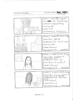
Before shooting or editing our video, we had to storyboard our chosen music video in order to see what would be happenng where. Storyboarding involves drawing pictures of what will be happening in each scene, writing what lighting, what shot type and how long the shot will be. For example: Close up of lead singer, dark lighting for approz 5seconds. The point of storyboarding is that on the day we have an accurate outline second by second of what shots we wanted and how we wanted it to look. It acted as a rough cut for our video. Because of how media technoliges have advanced we were able to film out story board up against a white wall. put it onto final cut pro with a wav. file of our song, and edit it together into a sotry board anamtic. This was helpful because it meant we had a rough idea of how our product could eventually look, and what might needed to be changed or adapted if a certain shot was too long or didnt work well next to another one. A story board looks like this:
The internet has been a vital tool to helping us in pre-production. This EBlogger site itself has allowed to to document our whole process of making a video in succint order with headings and dates, plus it also allows us to publish in powerpoints and pressies.
Youtube was of course imperitivie to us being able to plan our music video. Being able to surf the this site and watch almost every music video we wanted to meant that we had unlimited research devices. This new media technolgy meant that we had infite resources at our disposal and we could look up videos and take inspiration from them. Plus, we could see what audiences had commented on the videos to see if this direction is well recieved by a mass audience or if controversy is found unappealing by to many for it to have any effect.
This video 'Smack my Bitch up' is one of the biggest videos with controversy sorrounded around it, so by looking at the comments on it we could see that people enjoyed it.
Moblie phones are a new media technology which have been essential in the helping of our pre production. When we have been on the go and no had time to get out a proper camera and we needed to take aq picture of a set desgin or poster desgin we can simply take a picture on on phone and upload straight onto the internet and post it on our blog. This is a impeciably usful resource becasue we are constantly on our phones and so being able to pop up information in the space of seconds ontot eh internet has speeded along our progress profoundly.

Overall, these new media tehcnologies have vastly inproved our work in pre production as it had allowed us to create everything digitally without hassle and to quick effect.
Monday, 30 January 2012
Friday, 27 January 2012
Feedback on evaluation Task Three
Looking forward to seeing the results of your focus group posted. In address of the evaluation questions, it would be better to comment on specific examples in your audience feedback - perhaps this will be illustrated in the video's that you want to post. I feel that you understand the use of the decoding model that Hall comment's on - in terms of preferred, negotiated and oppositional readings, but you need greater application of this model to your audience responses then draw out the conclusions that you make. Also you seem to have focused on the music video - what about the poster and digipak? Once the video is posted can you develop your task in accordance with the points I make above? Excellent effort on task.
Thursday, 26 January 2012
Evaluation Task 3 - Focus Group
As seen in our focus group, they found the video intresting to watch and agreed that they would happily view it again. However, when asked it seemed that they didnt grasp the concept of the video, we had the opinion that it was domestic violence, but then beacuse it was being performed on each other that they got confused. Once told that it ws about S&M they said it made far more sense to them. There was a debate about which ages they thought it should be shown to, one person said age 12 but another highly disagreed and said no more 14-15 plus. This is what we had settled on, more to this age range. However, in this focus group they were all of the age of 17years and when we asked the older generation they said they would not want to watch it, or show it to their children. They liked the digipak and poster and thought that it all linked in well nicely, although they would make the band poster look more edgy to suit the style of the video. Draw backs with our focus group could be is that they were all female. which meant they would have a very different response to how a male would view it. Otherwise, it was an effective means of getting audience feeback, from the audience that we were focusing on.
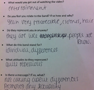
In relation to our questionaire there were 2 boys and 3 girls each of whom answered indiviudally a questionaire. They aged from the ranegs of 16-17 and all decided bar one boy that the video made them feel slightly disturbed and was expressing wider issues that society tries to hide.
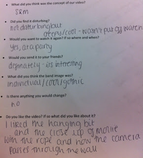
Looking at Hall, we decided that our prefered reading would be for people to understand the concept of S&M and to realise that this type of thing is not uncommon and that these issues are often ignored. The negotiated reading would be that they didnt really understand the concept and thought it was more like domestic violence but still found that these issues needed to be addressed. The oppositional reading would be that they found it disturbing and would not like to watch it againa dn just found it to have a pointlesss meaning. With this in mind it was interesting that most of our focus group had a negotiated reading but still found it interesting to watch. And once told about the concept foudn that they had easily missed the prefered reading and if had been watching closer could have understood it better.
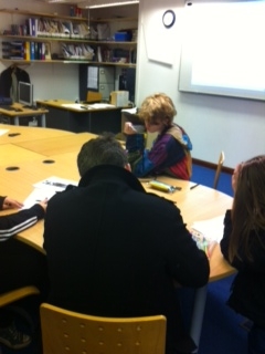
Our audience was deffenetly not passive, they were active memebers in deciding what our video was abotu and what worked and didnt. All this information helped because it meant that before we would release our Music Video we could accomidate to our audiences preferences.
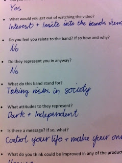
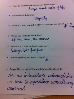

In relation to our questionaire there were 2 boys and 3 girls each of whom answered indiviudally a questionaire. They aged from the ranegs of 16-17 and all decided bar one boy that the video made them feel slightly disturbed and was expressing wider issues that society tries to hide.

Looking at Hall, we decided that our prefered reading would be for people to understand the concept of S&M and to realise that this type of thing is not uncommon and that these issues are often ignored. The negotiated reading would be that they didnt really understand the concept and thought it was more like domestic violence but still found that these issues needed to be addressed. The oppositional reading would be that they found it disturbing and would not like to watch it againa dn just found it to have a pointlesss meaning. With this in mind it was interesting that most of our focus group had a negotiated reading but still found it interesting to watch. And once told about the concept foudn that they had easily missed the prefered reading and if had been watching closer could have understood it better.

Our audience was deffenetly not passive, they were active memebers in deciding what our video was abotu and what worked and didnt. All this information helped because it meant that before we would release our Music Video we could accomidate to our audiences preferences.


Evaluation Task 3 - Part 1
Here we have screen shots of Youtube and Facebook comments which have been said by the public, in regard of our Music Video:
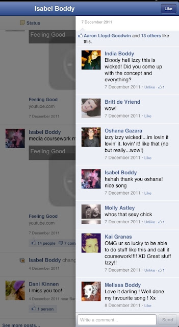
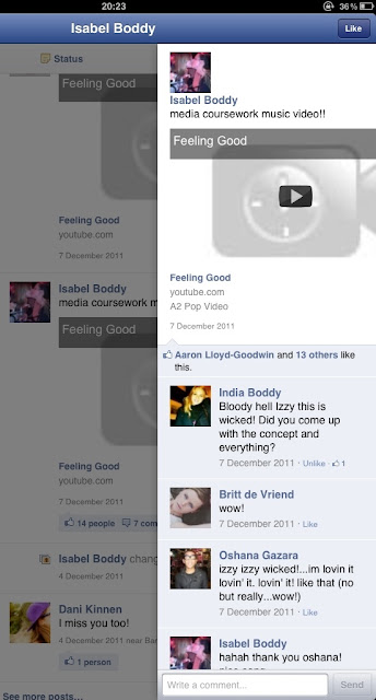
From this part of our audience we got the general feedback that they found that the video was slickly edited and well put together. They seemed shocked at the concept of our video but intrigued at the same time. Our audience also agreed that our band image suited the song and that the song suited the concept, and that everything tied up well with each other.


From this part of our audience we got the general feedback that they found that the video was slickly edited and well put together. They seemed shocked at the concept of our video but intrigued at the same time. Our audience also agreed that our band image suited the song and that the song suited the concept, and that everything tied up well with each other.
Monday, 23 January 2012
Feedback on evaluation Task 2
I like the presentation, in fact this is excellent. I particularly think that you have carefully considered the consistency of the campaign and it's placement. You have clearly considered the controversial nature of the video and images and how this may be scheduled without upsetting the audience. In fact I think you have nailed an explanation of what controversy is caused in the music video and how this fits into the overall campaign and brand image of the band. You attempt to sustain this image across the MV and ancillary tasks. I also think that you incorporate Dyer's star image well into your entry which again adds depth to the arguments that you make.
Our questionaire
Questionnaire:
Circle answers
- Are you male/female?
- How old are you?
- What’s your favourite music genre?
- What did you think was the concept of our video?
- Did you find it disturbing?
- Would you want to watch it again? If so where and when?
- Would you send it to your friends?
- What did you think the band image was?
- Is there anything you would change?
- Do you like the video? If so what did you like about it?
- What did you not like about it?
- Do you think the poster and video linked together?
- Would you buy the album?
- Did you like the digipak design?
- What would you get out of watching the video?
- Do you feel you relate to the band? If so how and why?
- Do they represent you in anyway?
- What do this band stand for?
- What attitudes to they represent?
- Is there a message? If so, what?
- What do you think could be improved in any of the products?
- Do you think they all seem like they are from the same band? Or there some differences in the image?
Saturday, 14 January 2012
Evaluation Task 1 – Conventions
Monday, 12 December 2011
Digipak
1st Draft:
This draft is to give you an idea of what the final draft is going to be. We decided to make the lead singer the focus of attention. We displayed this by having him in the middle of the image with the rest of band set smaller behind him. We also have a single image of him in a dark atmosphere showing the darkness of the single and also focusing on him.
2nd:
This is the final draft. The changes i did to this image is that I made Patches image more contrasted and brighter to emphasise his expression. With the image of the whole band I made the background white when before, the sides were black. I got the image of the back cover from google images. I used this image because it related to the narrative of our single. Its dark and relates to the hanging scene in our music video.
Saturday, 26 November 2011
Feedback
There is some reflective explanation of the shoot day - well done. You do need to extend this slightly in review - perhaps link comments to what shots you directed. Also the pictures you use are good, but could be presented in a different way - using other online tools.
Pictures from our shoot day
Due to the fact that our photographer did not turn up, we all took some pictures on our phones to upload to our blogs.
Here is our guitarist and pianist in our set whilst we were getting a two-shot of them.
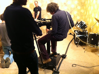
Here is a picture of me operating the camera and getting a close up of the base guitar. I had to keep moving the camera to make sure he did not go out of shot.
This is the monitor which was connected to the camera which enabled us and other people to see how the shots were looking and point out anything which needed to change.
This is the machine used to operate the lighting changes. We had 4 different lighting changes during our track.
This is another photo of me getting a shot of our base guitarist.
Here is the camera we were using throughout our shoot. We had another one the same close by which we used when for example we needed to keep the first camera in a certain position on the dolly, In that case, we just swapped the memory cards.
Thursday, 24 November 2011
Evaluating shoot day
Our shoot was on the 21st of Novemeber. The day started out slightly more un-organised as we had hoped as we found out our guitarist would not be around from 12-1 10. So we had to ensure that all of the shots of the bands where done before this time.
Plus, the day of building our shoot the group before finished late so we had limited time to get out set together. We new we wanted the overall mise-en-scene to be the backdrop of a sleezy hotel room, so we picked out typical wall paper and ripped parts of it and through teebags at the wall to give it a dirty brown effect, plus we used 'mould spray' on the walls. In the narrative we also set up a bed with dirty sheets on it and a table with vodka and wine bottles plus with an overflowing ash tray, to give the desired effect.
On the day we issued out roles within the group as it made it far easier to control what was going on if everyone had their own things to be doing. I had the role of the director - "A film director is a person who directs the actors and film crew in filmmaking.They control a film's artistic and dramatic aspects, while guiding the technical crew and actors". http://en.wikipedia.org/wiki/Film_directo. This meant I watched on the screen what was being filmed (by Izzy) and told her whether the shot worked or not or what i wanted. Similary, i also organised the band on stage to how i wanted them and what positions i thought worked best. Firstly, we did a run through with the band so they new what was happening and how the song worked, and then decided what lighting we wanted and how it should be postioned. I really enjoyed being the role of the directer as it allowed me to take control of how i wanted things, as quite a creative person i thought it was best as i could control what shots were taken and whether they worked. Also, this was helpful when shooting our narrative as i could directer our actors how i thought best it was for them to be acting, and i could direct how i wanted the scene to unfold. Being the director i also took control of doing the bands make up and helping molly (our main narrative girl) get in and out of her harness safely.
Will Edgely in our group was in charge of the lighting:
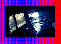
We decided we wanted dark dingy lighting to go with the mise-en-scene and also having spotlights on Patch the lead singer. To help heighten this however, we also used a very high shutter speed on the camera, where usually it is at 50 we had it at 150, which helped to heighten this effect. Will also had to job to make sure that the different lighting settings came on when required throughout the song, as it changed from washes to spotlights depending on whom we wanted the focus to be on.
Izzy was good on the camera as in our group she knows the most about it, this meant that we had a competent person on the camera and nerely all times so we didnt have to keep on going back and re-shooting things. She was effiecent at using the white balance and keeping it all in focus at all times. Although both me and Will took turns on using the dolly for tracking shots as we to wanted a short time ont he camera, Izzy did a good job and ensuring all of our shots were done well.

Lizzy also contributed to it by being incharge of playback:

She had to be aware at all times of what was going on and where in the song we were so as soon as we needed it we could play it straight away and get on with filming. However, one problem was that we had oraganised a photographer for the day but unfortuantly they could not turn up so we had to make do with taking pictures on our phone. However, we also used a camera back stage to document the 'making of' of video.
Overall, the day went well and i think that it was very useful to have everyone doing their own certain jobs as it allowed everything to run smoothly without problems.
Plus, the day of building our shoot the group before finished late so we had limited time to get out set together. We new we wanted the overall mise-en-scene to be the backdrop of a sleezy hotel room, so we picked out typical wall paper and ripped parts of it and through teebags at the wall to give it a dirty brown effect, plus we used 'mould spray' on the walls. In the narrative we also set up a bed with dirty sheets on it and a table with vodka and wine bottles plus with an overflowing ash tray, to give the desired effect.
On the day we issued out roles within the group as it made it far easier to control what was going on if everyone had their own things to be doing. I had the role of the director - "A film director is a person who directs the actors and film crew in filmmaking.They control a film's artistic and dramatic aspects, while guiding the technical crew and actors". http://en.wikipedia.org/wiki/Film_directo. This meant I watched on the screen what was being filmed (by Izzy) and told her whether the shot worked or not or what i wanted. Similary, i also organised the band on stage to how i wanted them and what positions i thought worked best. Firstly, we did a run through with the band so they new what was happening and how the song worked, and then decided what lighting we wanted and how it should be postioned. I really enjoyed being the role of the directer as it allowed me to take control of how i wanted things, as quite a creative person i thought it was best as i could control what shots were taken and whether they worked. Also, this was helpful when shooting our narrative as i could directer our actors how i thought best it was for them to be acting, and i could direct how i wanted the scene to unfold. Being the director i also took control of doing the bands make up and helping molly (our main narrative girl) get in and out of her harness safely.
Will Edgely in our group was in charge of the lighting:

We decided we wanted dark dingy lighting to go with the mise-en-scene and also having spotlights on Patch the lead singer. To help heighten this however, we also used a very high shutter speed on the camera, where usually it is at 50 we had it at 150, which helped to heighten this effect. Will also had to job to make sure that the different lighting settings came on when required throughout the song, as it changed from washes to spotlights depending on whom we wanted the focus to be on.
Izzy was good on the camera as in our group she knows the most about it, this meant that we had a competent person on the camera and nerely all times so we didnt have to keep on going back and re-shooting things. She was effiecent at using the white balance and keeping it all in focus at all times. Although both me and Will took turns on using the dolly for tracking shots as we to wanted a short time ont he camera, Izzy did a good job and ensuring all of our shots were done well.

Lizzy also contributed to it by being incharge of playback:

She had to be aware at all times of what was going on and where in the song we were so as soon as we needed it we could play it straight away and get on with filming. However, one problem was that we had oraganised a photographer for the day but unfortuantly they could not turn up so we had to make do with taking pictures on our phone. However, we also used a camera back stage to document the 'making of' of video.
Overall, the day went well and i think that it was very useful to have everyone doing their own certain jobs as it allowed everything to run smoothly without problems.
Friday, 18 November 2011
Feedback
There is evident progress here with some reflection on your concept and the palnning of this. Some good points are made. A good range of photo's are blogged, but you should account for which ones you would use and which ones you would reject. You do need to re-blog your photo's into a tool which acts as a presentation, I do not think that you thought through how you wanted to present your photos.
Day before shoot
Today is the final day for prepartion before our shoot. We have lots to sort out, including our set and props. We cant get into the studio to set up before 3pm so after that we will have to miss our last lesson to sort everything out. We need to set up a square type room with hotel wall paper that we are going to rip and make dirty, hang pictures ont he wall, have a bedside table with a lamp and knife and forks and cups. Plus putting the bed in. We have decided that we want the same set for the performance side as well as the narrative to make it more similar, so it looks like it has been in the same place. Hopefully we will get this all achieved before our shoot so we are reading to start shooting first thing on monday morning.
Wednesday, 16 November 2011
Final Photos for the digipack
After the photoshoot today, we decided on the final pictures we wanted to use for our digipak. We decided on the front of the digipak, the photo of the lead singer on the inside, and the single pictures we are going to edit together for the inlay. We then edited them, cropped them and put them into black and white. Here are the final photos for the digipak:
HEAD SHOTS OF BAND
SHOTS FOR INLAY OF DIGIPAK
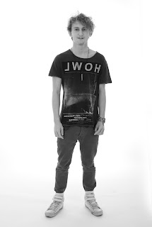
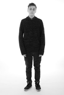
Shot for inside the digipak:
After the photoshoot today, we decided on the final pictures we wanted to use for our digipak. We decided on the front of the digipak, the photo of the lead singer on the inside, and the single pictures we are going to edit together for the inlay. We then edited them, cropped them and put them into black and white. Here are the final photos for the digipak:
HEAD SHOTS OF BAND
SHOTS FOR INLAY OF DIGIPAK


HEAD SHOTS OF BAND
SHOTS FOR INLAY OF DIGIPAK


Shot for inside the digipak:
After the photoshoot today, we decided on the final pictures we wanted to use for our digipak. We decided on the front of the digipak, the photo of the lead singer on the inside, and the single pictures we are going to edit together for the inlay. We then edited them, cropped them and put them into black and white. Here are the final photos for the digipak:
HEAD SHOTS OF BAND
SHOTS FOR INLAY OF DIGIPAK


Subscribe to:
Comments (Atom)


